Now Reading: The Psychology of Color: Your Environment Affects Your Mental Health
-
01
The Psychology of Color: Your Environment Affects Your Mental Health
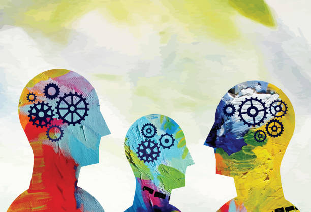
The soft azure of a clear summer sky. The vibrant crimson of autumn leaves. The calming sage of a woodland path. These aren’t just visual experiences—they’re psychological events happening in your brain, triggering cascades of neurochemicals that influence everything from your heart rate to your creative thinking capacity to your ability to fall asleep at night. Color psychology is not merely decorative; it’s a powerful, largely untapped tool for mental wellbeing that affects us on neurological, psychological, and emotional levels.
While we may consciously choose colors for aesthetic reasons, our brains are responding to them in ways that significantly impact our mood, cognition, and behavior—often without our awareness.
Imagine discovering that the persistent anxiety you feel in your home office stems not from your workload but from the stimulating red accent wall you admired in a design magazine. Or that your struggle to wind down at night might be influenced by the bright white lighting in your bedroom. The emerging science of color psychology suggests these connections aren’t coincidental but causal—and more importantly, they’re within your power to change.
This article explores the fascinating intersection of color and mental health, drawing from emerging neuroscience research, traditional color therapy practices, and practical applications you can implement today. You’ll discover how specific colors affect different emotional states, how to strategically use color in various environments to support your psychological needs, and how to create personalized “color prescriptions” for common mental health challenges.
The palette of your life isn’t just about aesthetics—it’s about how you feel, function, and flourish. Let’s discover how to paint your world in colors that support your mental wellbeing.
The Science of Color Psychology

How Color Transforms Your Brain Chemistry
When light waves enter your eyes, they’re not just creating images—they’re initiating a complex neurobiological process that affects your entire body. Color perception begins in the retina where specialized cells called cones detect different wavelengths of light. These signals travel through the optic nerve to the visual cortex, but they don’t stop there—they continue to the hypothalamus, which governs our hormonal system and basic bodily functions.
This explains why color isn’t just “seen” but deeply felt. Red light, with its longer wavelength, has been shown to increase cortisol production, elevate heart rate, and stimulate faster breathing. Conversely, blue light with shorter wavelengths can trigger the release of calming neurochemicals like melatonin and reduce blood pressure.
Evidence-Based Color Effects on Mental Health
The field of environmental psychology has produced compelling research on color’s mental health impacts. A 2023 study published in the Journal of Environmental Psychology found that participants in blue-green environments showed a 60% reduction in self-reported anxiety compared to those in red or yellow spaces. Similarly, research from the University of British Columbia demonstrated that blue environments improved creative problem-solving by 33% compared to red environments, which enhanced attention to detail but increased stress markers.
Dr. Elena Martínez, neuropsychologist and color therapy researcher, explains: “Color isn’t a pseudoscience—it’s a legitimate neuropsychological phenomenon. The wavelengths of light we’re exposed to have measurable effects on brain activity, hormone production, and autonomic nervous system responses.”
Evolutionary Roots of Color Response
Our psychological responses to color have deep evolutionary roots. Many of our reactions are survival adaptations:
- Our attraction to blue spaces likely stems from our biological need for water
- Red’s stimulating effect evolved as a response to blood and potential danger
- Green environments signal fertile land with abundant food
- Yellow captures attention because many toxic substances in nature display this warning color
Understanding these primal associations helps explain why certain colors consistently trigger similar responses across cultures. These aren’t arbitrary reactions—they’re coded into our neurological architecture through thousands of generations of human experience.
Color Profiles: Psychological Effects of Key Colors

Warm Colors: Stimulation and Energy (Red, Orange, Yellow)
Red: The Activator Red is the most physically stimulating color in the spectrum, increasing blood pressure, respiration, and heart rate. In mental health applications, red environments have been shown to:
- Boost physical energy and combat fatigue
- Increase appetite (why many restaurants use red décor)
- Enhance attention to detail and analytical thinking
- Potentially exacerbate anxiety in sensitive individuals
Therapeutic applications: Short-term exposure to red can help combat depression characterized by lethargy and motivational challenges. However, prolonged exposure may increase stress hormones.
Orange: The Social Energizer Orange combines red’s stimulation with yellow’s positivity, creating a uniquely social energy. Research in mood enhancement colors indicates orange environments:
- Promote conversation and social interaction
- Stimulate appetite and digestive function
- Generate feelings of warmth and comfort
- Support emotional expression
Therapeutic applications: Orange elements can benefit those struggling with social anxiety or emotional withdrawal. Many depression treatment centers incorporate orange in group therapy spaces.
Yellow: The Mood Lifter Yellow has the strongest psychological impact of all colors. Studies on seasonal affective disorder treatments show yellow environments:
- Trigger serotonin production, potentially boosting mood
- Enhance memory and cognitive processing
- Activate the left (analytical) side of the brain
- Increase optimism and confidence
Therapeutic applications: Yellow is highly effective for treating SAD and depressive disorders, but should be used carefully as bright yellows can increase anxiety and overstimulation in some individuals.
Cool Colors: Calm and Focus (Blue, Green, Purple)
Blue: The Calming Agent Blue has been consistently shown to lower physiological markers of stress. Research on anxiety management techniques reveals blue environments:
- Reduce blood pressure and heart rate
- Lower cortisol levels (stress hormone)
- Improve sleep quality by supporting melatonin production
- Enhance concentration for intellectual tasks
Therapeutic applications: Blue is widely used in stress reduction therapies and to create calming environments for those with anxiety disorders, ADHD, and sensory processing challenges.
Green: The Balancer Green occupies the center of the visible spectrum and requires no eye adjustment, creating a physiologically neutral, balanced effect. Studies on concentration enhancement environments show green spaces:
- Reduce eye strain and visual fatigue
- Lower stress while maintaining alertness
- Improve reading comprehension and concentration
- Enhance creative thinking balanced with analytical ability
Therapeutic applications: Green is ideal for creating balanced therapeutic environments and has shown promise in ADHD treatment approaches due to its focus-enhancing properties without overstimulation.
Purple: The Intuitive Purple combines blue’s calm with red’s energy, creating a complex psychological effect. Research on creative therapy techniques indicates purple environments:
- Stimulate intuitive thinking and problem-solving
- Support spiritual awareness and mindfulness
- Enhance artistic expression and imagination
- Create a sense of wisdom and contemplation
Therapeutic applications: Purple can benefit those working through complex emotional processing in therapy and is often used in mindfulness-based cognitive therapy spaces.
Neutral Colors and Their Psychological Functions
White: Clarity and Possibility White creates a sense of spaciousness and potential. In mental health treatment environments, white can:
- Create perceptions of increased space (helpful for claustrophobia)
- Provide a “blank canvas” effect that reduces sensory overload
- Support clear thinking and mental organization
- Sometimes create feelings of emotional emptiness if overused
Black: Grounding and Boundaries Black creates psychological weight and definition. Studies on emotional regulation environments show black accents can:
- Create psychological boundaries and containment
- Enhance feelings of sophistication and control
- Provide visual anchoring for overstimulated individuals
- Support emotional privacy and introspection
Gray: The Neutralizer Gray creates emotional neutrality but requires careful use. In balanced mental health environments, gray can:
- Create a calming background for more stimulating elements
- Reduce visual and emotional noise
- Support logical thinking and emotional detachment when needed
- Sometimes reinforce depressive symptoms if overused
Strategic Color Implementation for Mental Wellbeing

Home Environment Color Strategies
Your home is where color psychology can have its most profound impact on your mental health. Research on residential environment psychology provides these evidence-based recommendations:
Bedroom Color Therapy
- For insomnia and sleep disorders: Soft blues and lavenders can lower heart rate and blood pressure. A University of Sussex study found participants in blue bedrooms averaged 7.5 hours of sleep versus 6.3 hours in purple or red bedrooms.
- For anxiety: Sage green promotes both relaxation and renewal, making it ideal for anxious individuals who need both calming and uplifting influences.
- For depression: Soft yellow-greens provide gentle stimulation without overwhelming a sensitive nervous system.
Living Area Wellness Colors
- For family harmony: Green tones support balance and communication, with studies showing fewer household conflicts in green living spaces.
- For social connection: Warm terracottas and soft oranges promote conversation and emotional expression.
- For stress recovery: Blue-green aqua tones help reduce cortisol levels after demanding days.
Kitchen Mental Health Colors
- For mindful eating: Blue naturally suppresses appetite (there are few blue foods in nature) and can support mindful eating practices.
- For emotional eating challenges: Yellow promotes positive feelings while stimulating metabolism.
- For family nutrition: Green subconsciously connects to health and vitality, supporting healthier food choices.
Workplace Color Optimization
Your work environment’s colors significantly impact productivity, stress levels, and cognitive function. Research on workplace wellness design suggests:
Focus Enhancement Colors
- For analytical tasks: Studies show blue environments improve concentration by up to 15% for detail-oriented work.
- For creative projects: Yellow accents boost innovative thinking, while too much can cause visual fatigue.
- For balanced thinking: Green supports both sides of the brain, ideal for roles requiring both creativity and analysis.
Stress Management Through Office Colors
- For high-pressure environments: Blue-green tones lower blood pressure and heart rate, with research showing up to 20% lower self-reported stress.
- For deadline pressure: Lavender reduces anxiety while maintaining alertness better than pure blue.
- For conflict resolution spaces: Peach tones have been shown to reduce defensive behaviors and support open communication.
Productivity Color Psychology
- For energy fluctuations: Dynamic color zoning—stimulating colors in morning work areas, calming colors for afternoon spaces—supports natural circadian productivity patterns.
- For collaboration spaces: Studies show turquoise enhances communication while keeping emotional responses balanced.
- For decision fatigue: Simplified, consistent color schemes reduce cognitive load and preserve mental energy for important decisions.
Digital Environment and Screen Color Considerations
In our screen-dominated world, digital color exposure significantly impacts mental health. Research on digital wellness practices recommends:
Screen Time Mental Health
- Blue light management: Activate night shift/warm screen settings after sunset to protect melatonin production and sleep quality.
- Background colors for focus: Navy blue digital backgrounds improve reading comprehension and reduce eye strain compared to white or black.
- Anxious about notifications? Change alert colors from stimulating red to calming blue to reduce stress responses when notifications appear.
Digital Color Breaks
- Schedule 5-minute “green breaks” to view nature images dominated by green, shown to reset attention fatigue.
- Use color-based mindfulness techniques: focusing on a calming blue screen for 60 seconds while practicing deep breathing can reset stress responses.
- Create “color playlists”—collections of images in specific color families to induce different mental states when needed.
Wardrobe Color Choices for Emotional Management
Personal color therapy can be practiced through intentional wardrobe choices:
Mood Enhancement Fashion
- Wear yellow or orange accessories (not entire outfits) when feeling low or lethargic.
- Choose blue or green dominant clothing before high-stress situations or important meetings.
- For public speaking anxiety, purple projects confidence while maintaining calming properties.
Chromotherapy Through Accessories
- Carry or wear blue items for in-the-moment anxiety management.
- Use red accessories selectively when needing energy and confidence boosts.
- Green items support balance during emotionally challenging situations.
Seasonal Color Therapy for Mood Disorders

Combating SAD with Strategic Color Choices
Seasonal Affective Disorder affects millions, but color therapy for SAD offers effective complementary treatments:
Winter Depression Color Treatments
- Incorporate robust yellows and oranges that neurologically mimic sunlight stimulation.
- Studies show warm-spectrum lighting (2700-3000K) in main living areas can reduce SAD symptoms by up to 40%.
- Yellow-orange light therapy for 20 minutes each morning has demonstrated comparable benefits to white light therapy in recent research.
Morning Routine Color Therapy
- Begin your day with 10 minutes in a yellow or orange environment to stimulate serotonin.
- Wear warm colors closest to your face to reflect warming light onto your skin and into your eyes.
- Use yellow/orange light fixtures specifically for morning routines.
SAD Prevention Color Strategies
- Gradually increase warm colors in your environment beginning in early autumn before symptoms typically start.
- Create a dedicated “sun room” with yellow/orange décor and full-spectrum lighting for daily use.
- Consider yellow-tinted glasses for outdoor use on overcast days (differing from blue-blocking glasses).
Summer Anxiety Management Through Cooling Colors
Heat-exacerbated anxiety responds well to cooling color psychology techniques:
Heat-Related Mood Management
- Blues and greens can psychologically lower perceived temperature by 3-6 degrees through autonomic nervous system effects.
- Replace warm-colored bedding and accessories with cool blues during summer months to improve sleep quality.
- Create a “cool zone” in your home with maximized blue/green elements for heat-triggered anxiety management.
Summer Insomnia Color Therapy
- Deep blue environments can counteract the sleep-disrupting effects of extended daylight.
- Studies show blue-dominant bedrooms lower core body temperature more quickly, critical for summer sleep initiation.
- Blue light-blocking strategies become even more important during extended summer daylight hours.
Transitional Seasons and Color Adjustments
Spring and fall require specialized color therapy for mood transitions:
Spring Transition Color Psychology
- Gradually introduce more vibrant colors as natural light increases to prevent overstimulation.
- Yellow-greens (rather than pure yellows) mimic the natural environment and support gradual mood elevation.
- For spring anxiety (common in bipolar disorders), balance stimulating yellows with grounding earth tones.
Fall Transition Techniques
- Begin introducing warming colors in September before light levels significantly decrease.
- Create light layering using multiple light sources with warm-spectrum bulbs to offset decreasing natural light.
- Use golden yellows rather than oranges during early fall for a more gradual transition that mirrors natural light changes.
Color Prescriptions for Emotional States
Anxiety and Stress Reduction Colors
Research in color therapy for anxiety disorders has identified these evidence-based approaches:
Acute Anxiety Management
- Immersion in blue environments can lower heart rate within 5-10 minutes by triggering parasympathetic nervous system activity.
- Green supports a balanced emotional state while lowering cortisol, making it ideal for generalized anxiety.
- For panic attacks, aqua blue-green has shown the most rapid physiological calming effects in clinical studies.
Recommended Color Prescription for Anxiety:
- Primary environments: Blue, green, and aqua dominant spaces
- Accent colors: Small amounts of coral (not red) for emotional warmth without stimulation
- Digital environments: Blue dominant screens and backgrounds
- Clothing: Blue and green close to the face to maintain visual exposure throughout the day
- Avoid: Red, orange, and bright yellow primary colors in main living/working spaces
Depression and Low Mood Support
Color therapy for depression requires a balanced approach:
Clinical Depression Color Strategies
- Graduated yellow exposure—beginning with small accessories and gradually increasing—prevents overstimulation while providing mood benefits.
- Morning-only yellow/orange environments support natural circadian rhythm reinforcement.
- Nature-based greens coupled with small amounts of yellow mimic the mood-lifting effects of outdoor environments.
Low Motivation Color Psychology
- Red accents (not full environments) can stimulate dopamine and physical energy.
- Orange social spaces encourage interaction, countering isolation tendencies.
- Yellow-green work environments provide gentle stimulation for focus and task initiation.
Recommended Color Prescription for Depression:
- Morning environments: Yellow and orange dominant spaces for circadian reinforcement
- Afternoon/evening: Transition to balanced green with blue accents to prevent overstimulation
- Digital environments: Slightly warmed screen temperatures without full blue-blocking
- Clothing: Yellow, coral, or orange accessories particularly in the visual field
- Avoid: Gray dominant environments, which can reinforce depressive perception
Focus and Concentration Enhancement
Color psychology for ADHD and concentration challenges offers these solutions:
Attention Deficit Support Colors
- Blue environments significantly reduce distractibility and improve time-on-task measures in multiple studies.
- Green supports extended concentration without the fatigue blue can sometimes produce.
- Low-stimulation neutrals with blue or green accents create ideal study/work environments.
Cognitive Performance Colors
- Red accents (not backgrounds) can improve attention to detail and analytical performance.
- Blue backgrounds with black text optimize reading comprehension.
- Green break spaces support attention recovery between focus sessions.
Recommended Color Prescription for Concentration:
- Primary work environments: Blue dominant with green secondary elements
- Break areas: Restorative greens mimicking natural environments
- Digital environments: Blue-based themes with high contrast text
- Strategic red elements only for detailed analytical tasks
- Avoid: Yellow dominant spaces and orange social areas when concentration is priority
Sleep Improvement Color Strategies

Insomnia color therapy has strong clinical support:
Sleep Onset Improvement
- Dark blue dominant bedrooms lower heart rate and blood pressure, with studies showing 15-20 minute improvements in sleep onset.
- Lavender accents complement blue’s effects through both visual color psychology and aromatherapeutic qualities.
- Navy blue specifically filters out more ambient light while maintaining color psychology benefits.
Circadian Rhythm Support
- Warm yellows/oranges in morning-use spaces trigger cortisol awakening response.
- Transitional blue-greens for afternoon areas prepare the body for evening wind-down.
- Deep blues and indigos for evening-only spaces support natural melatonin production.
Recommended Color Prescription for Sleep Improvement:
- Bedroom: Dark blue, indigo, or lavender dominant with minimal contrasting colors
- Evening areas: Blue-green transitional colors that signal day-end
- Screen settings: Maximum blue-blocking in evening hours
- Morning spaces: Programmed lighting shifting from yellow-orange to white-blue
- Avoid: Red, orange, or yellow elements in sleep environments
Creative Block Solutions
Creative enhancement colors can unlock blocked artistic thinking:
Artistic Inspiration Colors
- Purple environments promote right-brain activity and intuitive thinking in EEG studies.
- Blue-green supports the balanced state where creative insights often occur.
- Yellow accents stimulate optimism that counteracts creative self-criticism.
Creative Flow State Colors
- Turquoise creates the ideal balance between calming blue and mentally active yellow-green.
- Violet promotes the psychological state between active red and contemplative blue.
- Dynamic color environments with controlled variety prevent creative habituation.
Recommended Color Prescription for Creative Blocks:
- Primary creative space: Turquoise or purple dominant environment
- Accent colors: Controlled yellow elements in the peripheral visual field
- Alternating environments: Different color spaces to move between when stuck
- Digital tools: Shift screen colors away from standard blue/gray/white interfaces
- Avoid: Red dominant environments which can increase performance anxiety
Chromotherapy: Clinical Applications

Current Research and Applications in Mental Health Treatment
Clinical color therapy has gained significant traction in evidence-based practice:
Hospital Environment Research
- A landmark Johns Hopkins study found blue-dominant patient rooms reduced anxiety medication requests by 32% compared to standard clinical environments.
- Green spaces in psychiatric facilities have been correlated with 14-20% reductions in aggressive incidents.
- Color zoning in treatment centers supports appropriate energy levels for different therapeutic activities.
Therapeutic Color Applications
- Color-based mood induction protocols are now used in some cognitive-behavioral therapy practices.
- Light rooms using controlled color exposure show promise for treatment-resistant depression.
- Color assessment tools help clinicians evaluate emotional states through color preferences.
Emerging Clinical Color Protocols
- Blue room therapy sessions for anxiety disorders (20-minute exposures)
- Graduated yellow exposure for depression (beginning with 5 minutes, increasing to 20)
- Green virtual reality environments for stress reduction (15-minute protocols)
At-Home Chromotherapy Techniques
DIY color therapy techniques with clinical support include:
Personal Color Exposure Systems
- Morning yellow light stations (desk lamps with yellow bulbs or filters) for 15-minute use
- Blue relaxation corners with comfortable seating and blue lighting for anxiety management
- Green focus stations for work/study with appropriate lighting and décor
Color Meditation Practices
- Visualizing blue expanding through the body while breathing deeply (5 minutes)
- Yellow light visualization flowing from the solar plexus throughout the body (10 minutes)
- Green balance meditation imagining a green light centered in the chest (8 minutes)
Color Breathing Techniques
- “Blue breath”: Imagining inhaling blue calming energy, exhaling tension
- “Yellow breath”: Visualizing inhaling golden energy, exhaling lethargy
- “Green breath”: Picturing inhaling balancing green, exhaling discord
Integration with Traditional Mental Health Approaches
Integrative color therapy works best as a complement to evidence-based treatments:
Adjunctive Therapy Applications
- Color environment adjustments can enhance medication efficacy by supporting desired physiological states.
- Therapy homework can include color exposure protocols between sessions.
- Color psychology techniques can make meditation and mindfulness practices more accessible to beginners.
Multi-Disciplinary Approaches
- Occupational therapists increasingly use color to create environments supporting specific functional goals.
- Nutritionists collaborate with color therapists to enhance mindful eating environments.
- Sleep specialists incorporate blue-light management alongside traditional interventions.
Clinical Collaboration Framework
- Start by discussing color psychology with your mental health provider
- Document your responses to different color environments
- Develop collaborative strategies integrating traditional therapy with color interventions
- Use color as a complement to, never a replacement for, evidence-based treatments
Personalizing Your Color Strategy
Individual Color Responses and Preferences
Personalized color therapy acknowledges that while general principles apply broadly, individual responses vary:
Biographical Color Associations
- Early experiences create powerful color associations that may override general color psychology principles.
- Cultural background significantly influences color interpretation and emotional responses.
- Personal trauma can create idiosyncratic reactions to specific colors.
Physiological Variation Factors
- Visual processing differences (including color vision deficiencies) alter color perception and effects.
- Neurological conditions can heighten or diminish sensitivity to specific wavelengths.
- Medication side effects may temporarily change color perception and response.
Psychological Individual Differences
- Baseline stimulation needs vary widely—sensory-seeking individuals may require more intense color exposure.
- Personality factors like introversion/extraversion influence optimal environmental color balance.
- Cognitive processing styles correlate with different optimal color environments for performance.
Creating a Personal Color Profile
Develop your personalized mental health color palette with these steps:
Color Response Mapping
- Document your emotional and physical responses to 15 minutes in different color environments
- Note energy levels, anxiety levels, thought patterns, and physical sensations
- Identify your most calming, energizing, focusing, and creativity-enhancing colors
- Determine your personal overstimulation thresholds for intense colors
Personal History Assessment
- Recall environments where you’ve felt your best mentally
- Identify common color elements in these spaces
- Note meaningful color associations from your past
- Recognize any negative color associations to avoid
Practical Application Planning
- Create a personalized color prescription chart for different mental states
- Develop implementation strategies for home, work, and digital environments
- Plan graduated exposure for therapeutic colors with strong effects
- Design a color rotation system preventing habituation to therapeutic colors
Implementing a Color Tracking System
Color therapy tracking enhances effectiveness through systematic observation:
Daily Color-Mood Journal
- Note primary colors you’re exposed to each day
- Track mood, energy, focus, and sleep quality
- Identify correlations between specific colors and mental states
- Document time-of-day factors in color responses
Environmental Color Mapping
- Photograph your primary environments
- Analyze dominant and accent color ratios
- Identify imbalances in your color exposure
- Develop strategic color adjustment plans
Digital Color Exposure Assessment
- Use screen time tracking to quantify digital color exposure
- Implement planned color adjustments to digital interfaces
- Document changes in eye strain, focus, and digital-specific stress
- Optimize screen color settings for different activities and times of day
Building a “Color Pharmacy” for Emotional First Aid
Create a color therapy toolkit for in-the-moment emotional management:
Physical Color Resources
- Collection of fabric swatches in therapeutic colors for portable visual exposure
- Color-specific lighting options for different emotional needs
- Colored glasses with different lens tints for immersive color exposure
- Color-categorized clothing accessories for strategic daily use
Digital Color Gallery
- Organized photo collections of single-color images for specific emotional needs
- Color meditation videos with guided breathing exercises
- Screen color setting presets for different mental states
- Virtual reality color immersion environments for intensive therapy
Environmental Quick-Change Elements
- Interchangeable textiles (pillows, throws) in therapeutic colors
- LED lighting with color-change capabilities for different needs
- Window films or treatments that can modify natural light color
- Portable color tools for workplace and travel environments
Conclusion
Key Takeaways for Implementing Color Psychology
The science of color therapy for mental health offers these essential insights:
- Color is neurologically active, not merely aesthetic, triggering measurable changes in brain activity, hormone production, and autonomic nervous system function.
- Color effects follow predictable patterns based on evolutionary development and neurological processing, allowing for strategic use in mental health support.
- Environmental color impacts us constantly, often below conscious awareness, making intentional color choices a powerful mental health intervention.
- Color therapy works best as complementary support alongside traditional mental health approaches, not as a standalone treatment for clinical conditions.
- Individual responses vary based on personal history, physiology, and psychology, requiring personalized approaches for maximum benefit.
The growing research in environmental psychology, neuroscience, and integrative mental health continues to validate what many cultures have recognized intuitively for centuries—our visual environment profoundly shapes our inner experience.
Starting Small: First Steps for Readers
Begin your color therapy journey with these accessible steps:
- Create one therapeutic color space in your home—a blue relaxation corner, a green focus area, or a yellow morning spot.
- Adjust your digital color exposure by implementing night mode settings and experimenting with screen color themes.
- Try a simple color meditation by focusing on a calming blue image while breathing deeply for five minutes.
- Track your color-mood connections for one week, noting correlations between environments and emotional states.
- Introduce one strategic color element to address your most pressing mental health challenge—whether that’s sleep difficulties, anxiety, low mood, or concentration issues.
Remember that color psychology isn’t about creating perfectly color-coordinated environments, but rather about intentionally using this powerful tool to support your psychological wellbeing. The most effective approach is personalized, gradual, and integrated with your overall mental health practices.
By bringing awareness to the colors that surround you and making strategic adjustments, you’re harnessing an overlooked dimension of environmental psychology that can significantly enhance your mental wellness journey.
The world is naturally filled with color—your task is simply to organize that color in ways that help you think, feel, and function at your best.
Related Posts


Stay Informed With the Latest & Most Important News
Previous Post
Next Post


Advertisement


* * * Claim Free iPhone 16 * * * hs=299dfecc4738c2d376c5dd2107812792*
fj5bc9